Help me brainstorm Witch Fall's cover

Wednesday, April 24, 2013


Witch Fall is due out this October, which means it's about time to get started on the cover. I plan to have Laura Sava, who did Winter Queen, finish the last cover in the series. 

I want all the books to look like they belong together, so we'll utilize the same tones and feel. There are two-ish options I'm considering. Let me know which one you like best in the comments.

Option 1: the pendant featured in the center with plant leaves and curly vines around the outside. Featuring a magical object is something that's done a lot in high fantasy novels. Some examples: 
The Gray Wolf Throne (Seven Realms, #3)
The Girl of Fire and Thorns (Fire and Thorns, #1)The False Prince (The Ascendance Trilogy, #1)Graceling (Graceling Realm, #1)

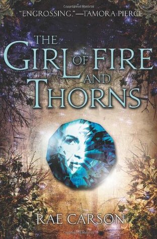
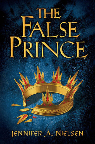
The magical item signals to the readers that the book is a high fantasy. Some of them are simpler than others, but one of the main jobs of a cover is to give you a visual story about what the novel is about. 

Option 2: Feature Lilette, much as Senna is featured. Because Witch Fall is a prequel, I thought I'd have her looking back toward us. I'll keep some of the same elements--namely, the warm earth tones, the pendant, one of my fantasy landscape on the back cover, the eyes that follow you. In each shot, the "camera" is further back, so Lilette's whole body would be featured. I'll try to incorporate one of the scenes from the book, I'm not sure which one yet. 

Option 3: Something different all together. Feel free to throw your own ideas out there!

12 comments:

  1. Oh, I really think you should go with option #2. ;)

  1. This comment has been removed by the author.
  1. This one is tough because you have to change artists. The problem with that is the high quality of the first two covers equated to a detailed, artistic look and style that can't be replicated even though the artist you picked kicks some major ass. She just kicks some major ass in her own style.

    (thinking out loud here)

    So, because the styles are different, I think it would be a good idea for option 2. That way, it's not an attempt to replicate the style of the first two books, which you won't be able to do anyway, and will let the artist you picked really cut loose in her own way because there is a lot of opportunity to add detail in her own particular style.

    Artistically, option 3 is the best. If you kept the same color scheme and book size then it fits with the series.

    My two cents. Regardless, you do a very, very good job with your covers. I am always impressed. That woman who runs your imprint knows what she is doing.!

    :p

  1. I think you should go with option #2 :)

  1. Yeah, option #2 seems to be the one.

  1. Pili said...:

    I'm leaning towards option 2. It would still fit with the other covers and I think some continuity and feel that it all is part of the same story is important.

  1. Unknown said...:

    Option 2 sounds like a better idea...

  1. Wow. Everyone's in agreement with option 2. That never happens. This is a sign, people. The book Gods are smiling on us. ;)

  1. I'm late to the party, but I'm with Option 2 as well. Interestingly, The Girl of Fire and Thorns is a favorite of mine, but I read it because of your recommendation. I'm not sure I'd have picked it up on the cover alone.

  1. Yay! Unity! I think that's what everyone is hoping for with the covers. Can't wait to see what Laura comes up with. The Winter Queen cover is gorgeous! :D

Post a Comment

Related Posts Plugin for WordPress, Blogger...